Digitype:
digitize typefaces
Turn scans of typewriter type samples - dirty, skewed, at any resolution - into clean, installable monospaced fonts. Show it where each character is; it averages every impression, traces it, and rebuilds it.
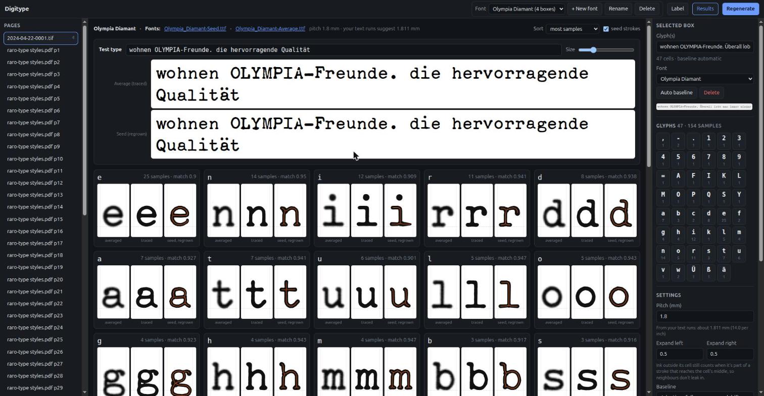
From a sample sheet to a font
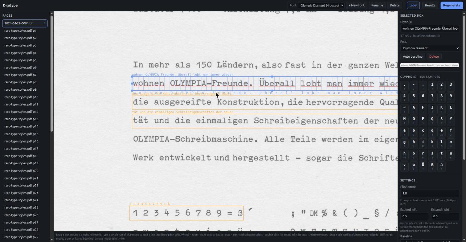
A typewriter prints every character in a cell of the same width. Digitype uses that: label whole lines of text, and every common letter gets many samples to average.
Label
Drag a box around a line and type what it says. It splits into fixed-pitch cells and warns when the text doesn't match the ink.
Line up
Baselines follow skewed and wavy lines; samples are levelled, scaled to one size and registered to each other.
Average
Every impression of a letter is averaged - dirt is different every time, the letter isn't. Odd samples are left out.
Trace & rebuild
The average is traced, and also reduced to a skeleton and grown back, for two versions of the face.
Install
Two true monospaced TrueType fonts, ready to install and use - or to cut new typewriter elements from.
Label lines, not letters
Type a line exactly as printed and it becomes dozens of samples at once.
- Images, multi-page TIFFs and PDFs; huge scans are fine.
- Cells snap onto glyphs in charts that aren't evenly spaced.
- Each cell's character is drawn under it, so a missing space shows at a glance.
- Several typefaces per project, kept apart as font sets.
Averaged, traced, regrown
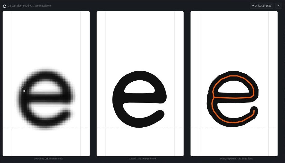
Each glyph comes out three ways, all at one common scale:
- Averaged - every impression laid over the others.
- Traced - the outline of the average: the faithful font.
- Seed, regrown - the letter reduced to its strokes and their widths, then grown back: the editable font.
The sinking island
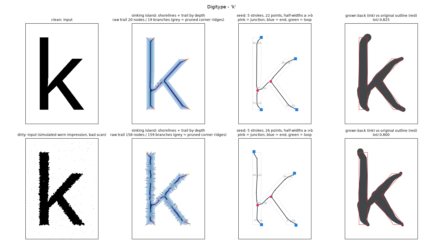
Lower a letter into water a little at a time. Where the shore from two sides meets and goes under, it leaves a trail; the depth at which each point went under is the stroke's half-width. Trail plus depth is the letter's seed - and a disc of that width at every point gives the letter back.
Dirt barely moves the trail. Specks leave short, shallow trails that are pruned; junctions and stroke ends show up as the island splits and vanishes. More on how it works.
Built for real scans
Any resolution
Scans of one face at different sizes are scaled to match and weighted by sharpness.
Smooth from one sample
Soft, sub-pixel edges and adaptive smoothing make single samples nearly as clean as averages.
Skew and waves
Adaptive baselines and tilt correction follow crooked lines.
Accents and marks
Umlauts, i-dots and % circles are kept; dots from neighbouring lines aren't.
Catches mistakes
Warns when a line's text doesn't match its ink, and leaves out samples unlike the rest.
Test type
Type a line and see it in both new fonts straight away.
Get started
Python 3.10+. Everything runs locally; nothing is uploaded anywhere.
git clone https://github.com/dairyking98/Digitype
cd Digitype
python3 -m venv .venv
.venv/bin/pip install -r requirements.txt
.venv/bin/python3 -m digitype label "path/to/your/scans"
On Windows, run.bat "D:\Scans\Type Samples" sets everything up on first run. Then open
http://127.0.0.1:8770, draw a box, type what it says, and press Regenerate.